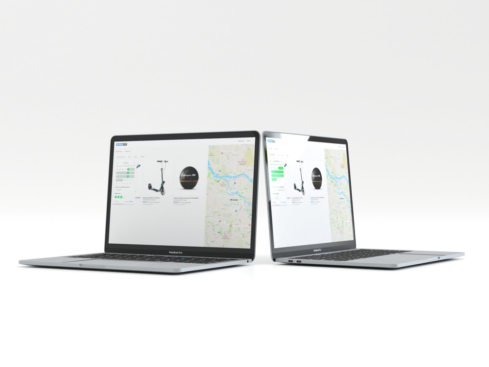
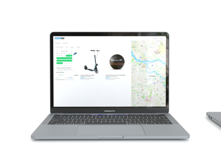
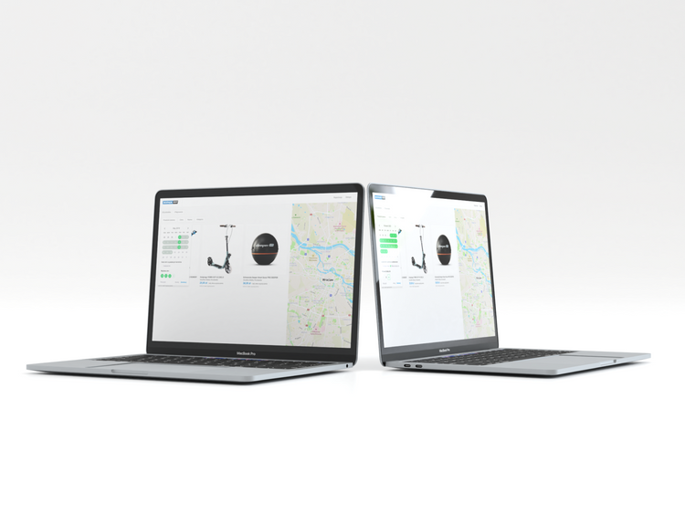
We created new functionality for Decathlon Rent - a filtering mechanism. It lets a user see the available equipment, easily determine the number of rental days, and save money selecting only days that he is interested in. Besides, our UX Writer has enhanced the copy of info boxes and the calendar to make them as user-friendly as possible.
Our role in this project was to create a new date filtering system. This solution helps users with choosing the number of days for which they want to rent equipment from the Decathlon store in the selected time period.
We did a preliminary analysis by comparing solutions available on the market and suggesting our own ideas. An important part was changing the communication that direct users in the filtering process and finding adjusted products for them. We prepared product documentation and offered key changes that would improve the user experience in the search which didn't work intuitively previously.
After defining a problem our team started to analyze the available possibilities of creating a new system. First of all, we prepared audits for similar functions in the competitions but it didn’t bring us expected results. We decided to choose methods similar to booking days in hotels and after adaptation to our problem it turned out to be a success.
As a result, we create a new design of the filter system and improve filtering logic which allows selecting the number of days in a time interval. Our client presented us with a website with a minimum viable product that was not created by UX Designer. The problem concerned user selection at the filtration stage.
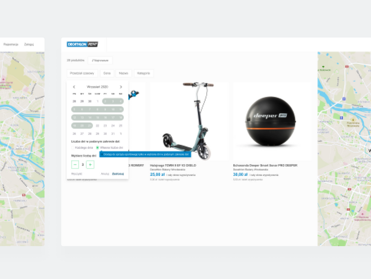
The application has been extended by an opportunity to mark the selected period for the orders and the number of days in which the client wants to use the equipment. The choice of days has been closed in the checkbox and appears after choosing the willing number.
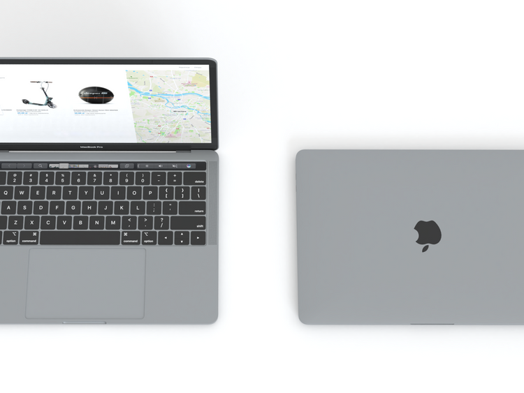
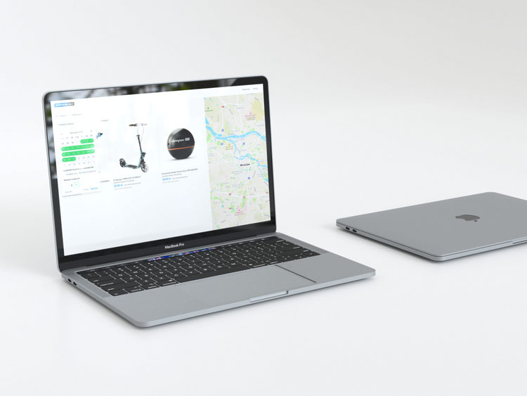
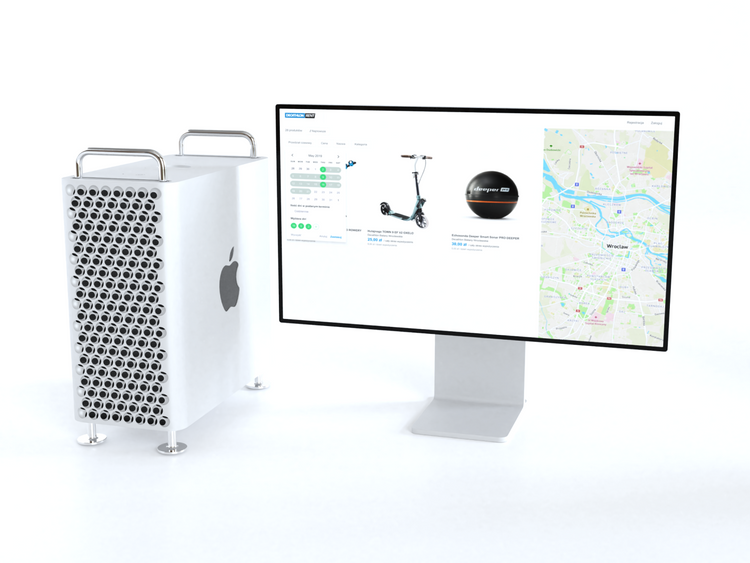
The visual design was created in the same system as our client’s website to make an impression of being integral with the rest functions.
A textual layer of interface had been polished up and simply started to empower the service. Well-crafted copywriting guides the user through the consecutive stages until they reach their goal.
The functionality went through internal usability testing by creating prototypes, so we were aware of choosing the best possible option. It confirms that we create a new data filtering system that meets the users’ expectations.
- Kickoff meeting
- Research UX
- Lo-fidelity wireframing
- Brainstorming
- Figma