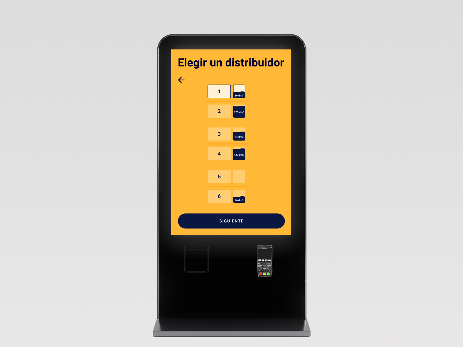
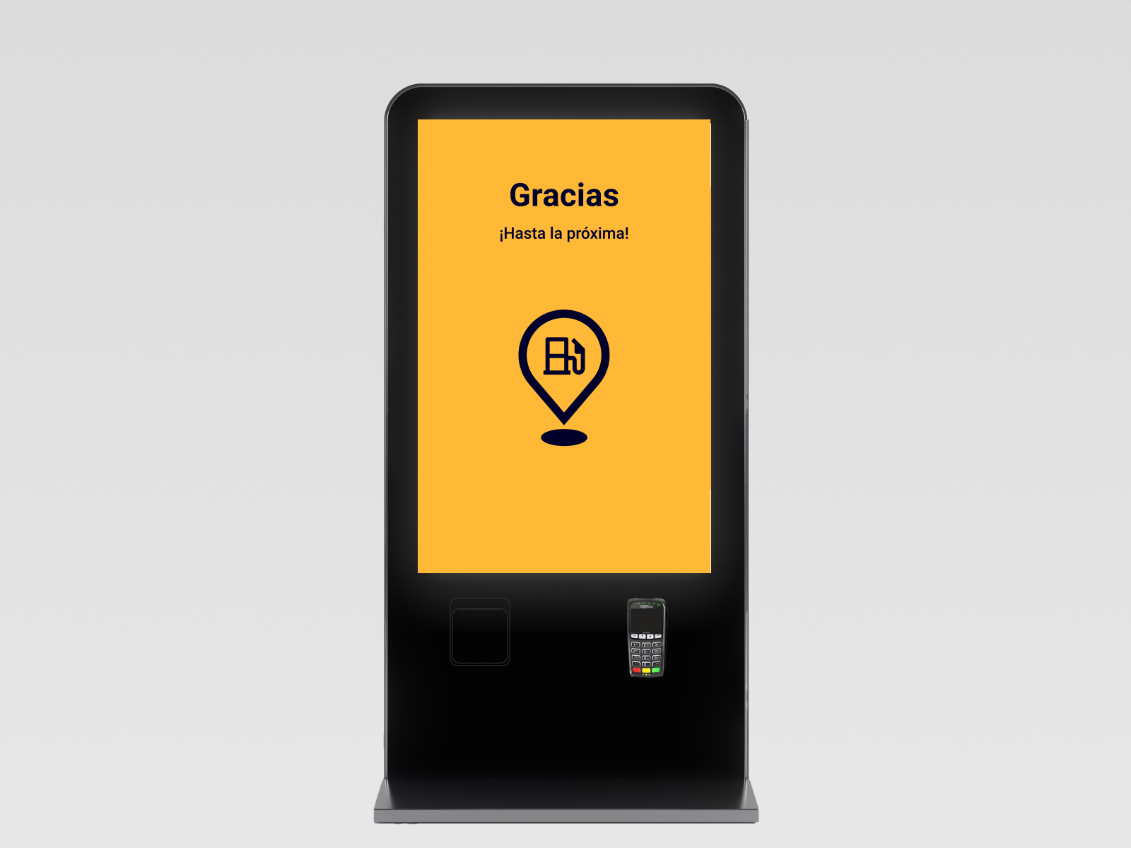
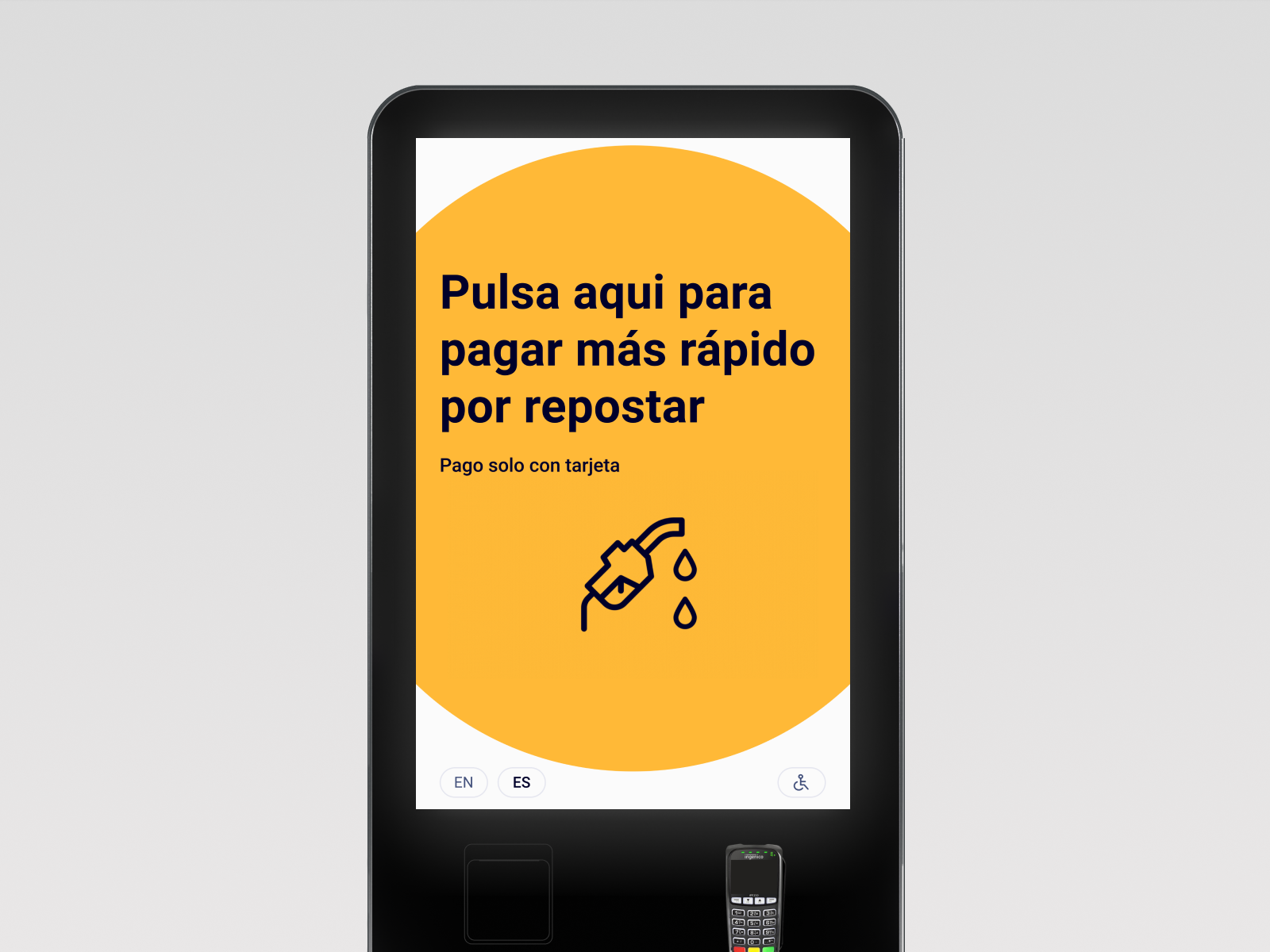
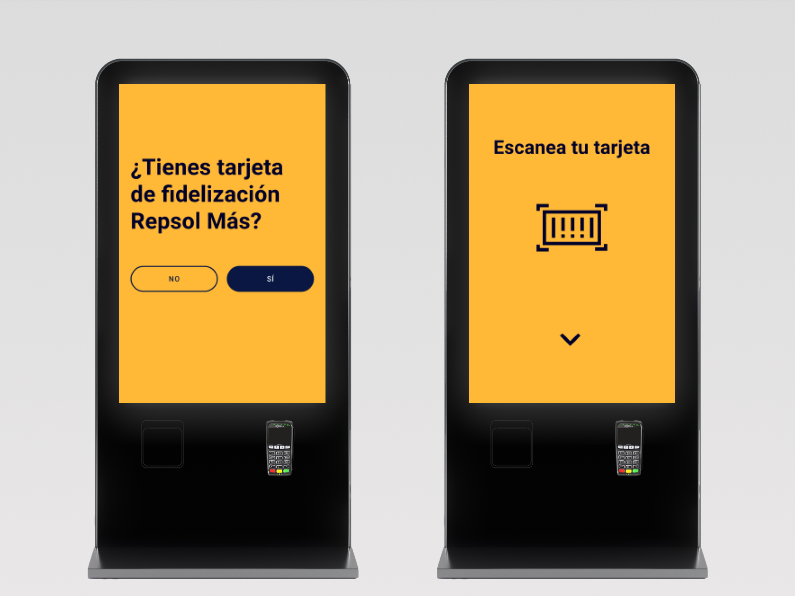
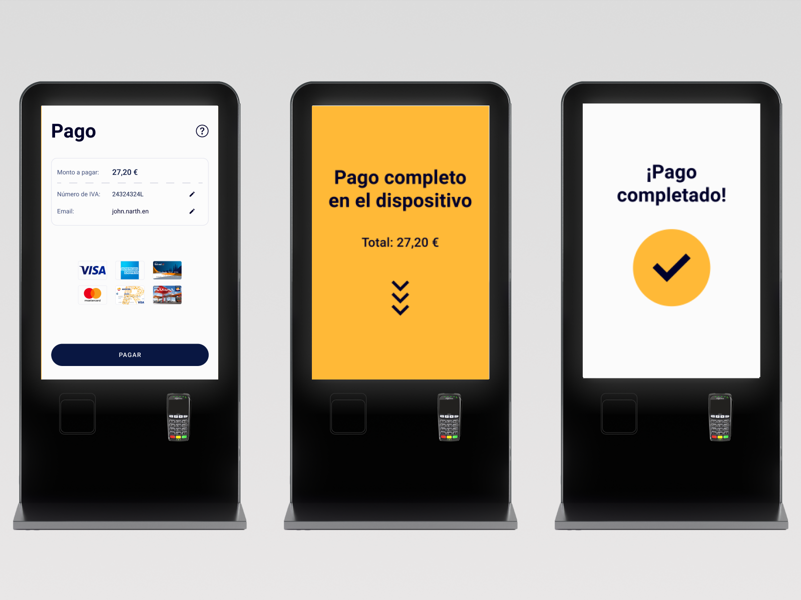
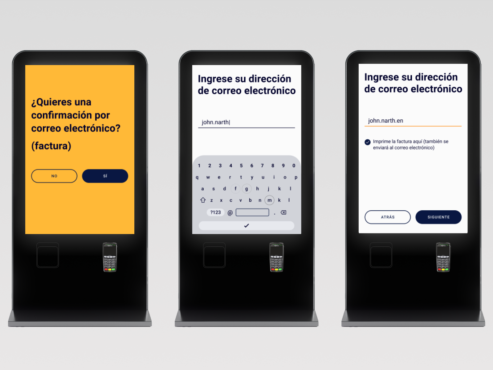
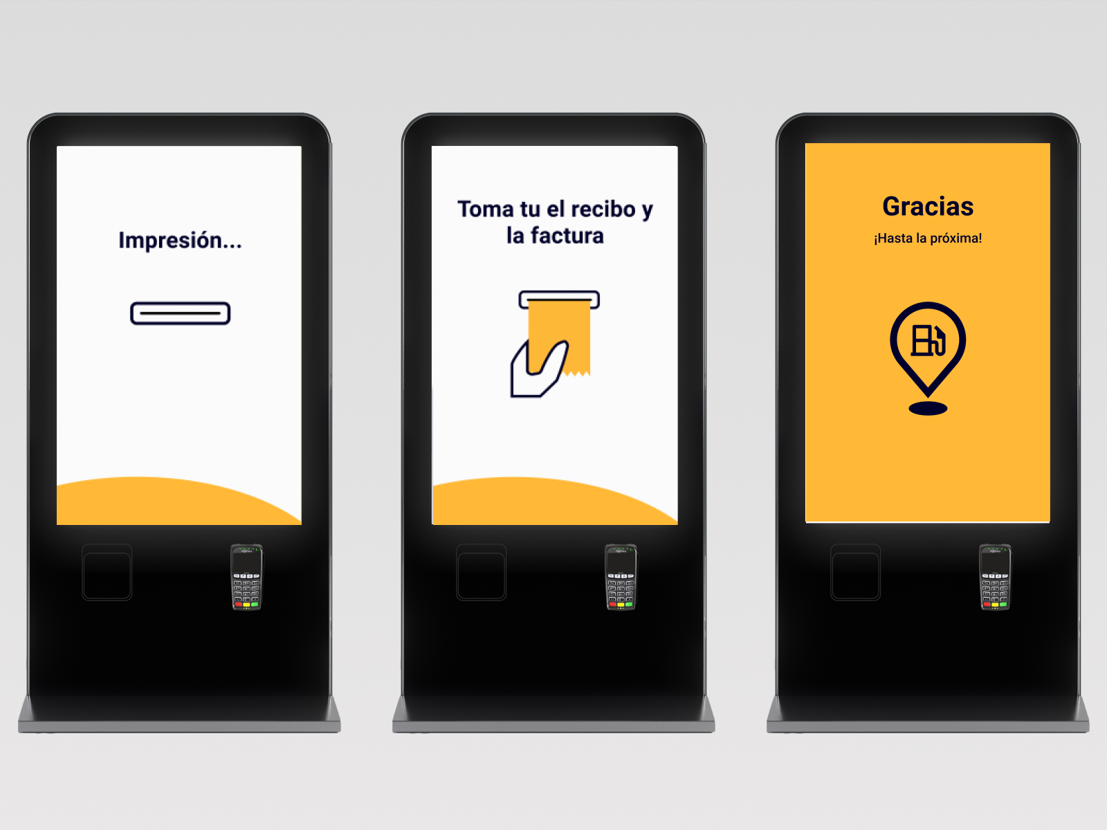
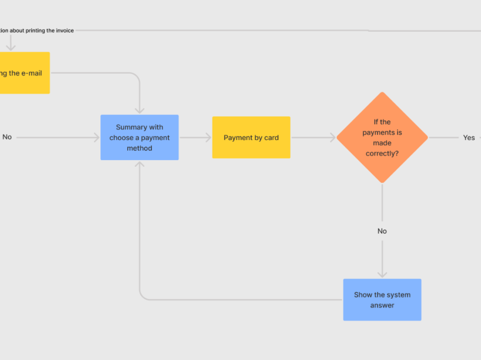
We were working on a user-friendly Self Service Kiosk for quick payments at the Spanish Repsol petrol station. Our major aim was to support the customer experience of the exchange money for fuel. Service customers have an easy way to find a distributor, add a loyalty card, realize payment by card, and print the bill or invoice. We created also a simple option to send invoices and bills to e-mail.
Repsol petrol station is one of the largest private oil companies in the world that made aware of how important small things can be for customers. Our aim of this project was to create and program a self-service kiosk for Repsol company.
Repsol company wanted to improve the operation of the station by making it easier for customers to pay for fuel. For this purpose, we have designed a self-service kiosk. It allows to pay for fuel near to the dispenser, there is no need to go to the cash register. We went through several important stages of the work. We took care of the preparation of both easy-to-use interfaces and the visual side of the project.
We define and set goals to achieve during working on this project. In the first stage, we did deep UX Research to better understand the needs and expectations of the target group. Thanks to this we create a self-service kiosk that is also suitable for disabled people. In the beginning, we created a lo-fi mockup and finish with the hi-fi mockup which included necessary animations and interactions.
The in-depth UX research phase consisted of several research techniques. We looked into personas, we conducted desk research, Google Analytics analysis, competitor analysis, benchmarking, cognitive and heuristics analysis. We created a webpage prototype based on findings and then conducted usability testing to find areas for improvement within our design.
The analysis contained a few stages: research, competitive analysis, user flow, architecture, design UI, and documentation. As we mentioned above, thanks to a thorough analysis of the research results, we were able to better understand the target group, i.e. the station’s customers. We also determined what their needs must be met to create a kiosk for them, which will simplify paying for fuel. The UX team also created the design by giving the screen view a readable look. We made sure that it was consistent with the character of the brand. UX writers improved clarity and usability on the screen.
The analytics we used to better understand the issues on the user side inform the process we followed. We made research and competitive analysis. Based on it we created integral and accurate documentation. This ensured that every step we took was carefully laid out and planned.
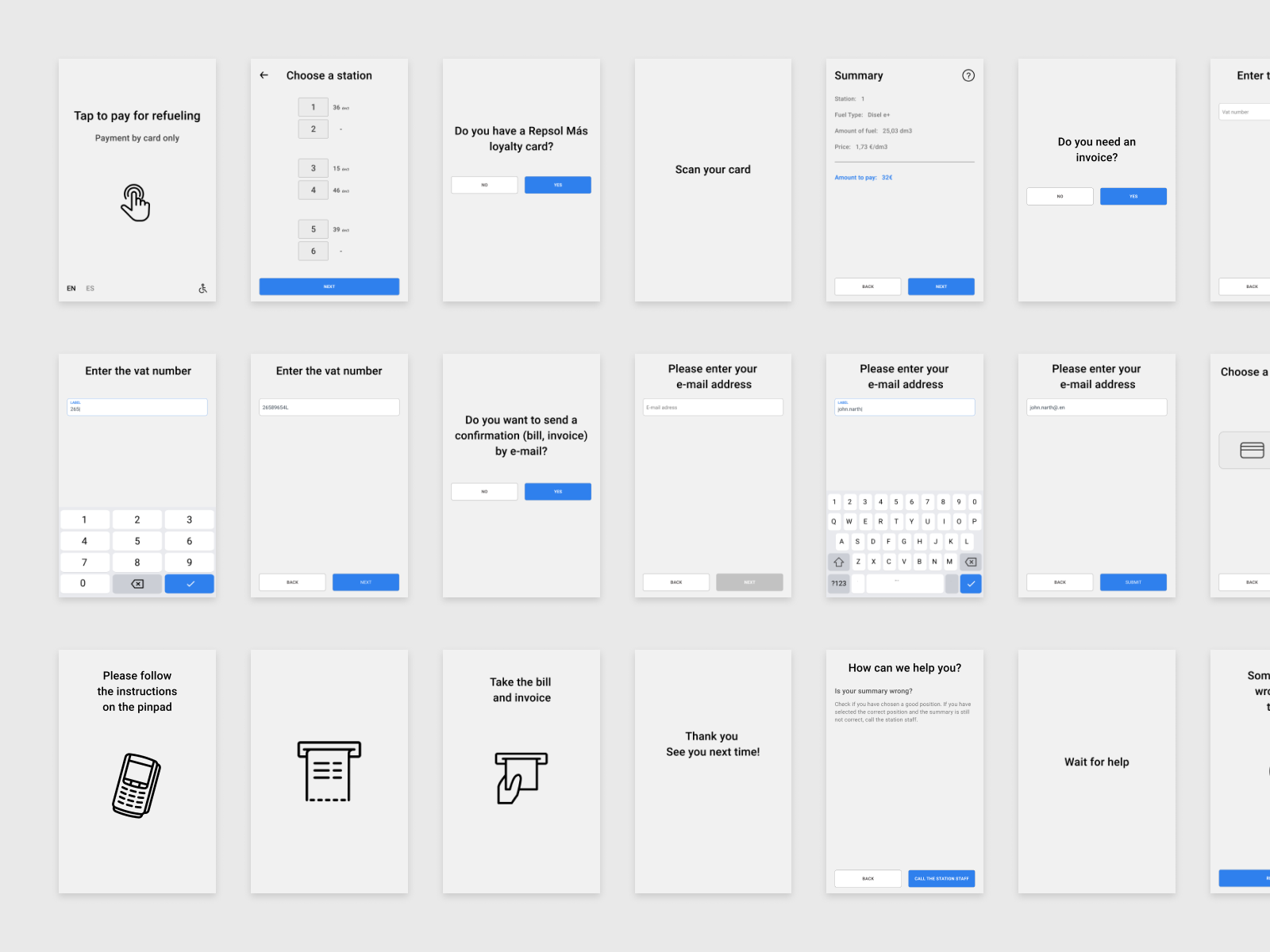
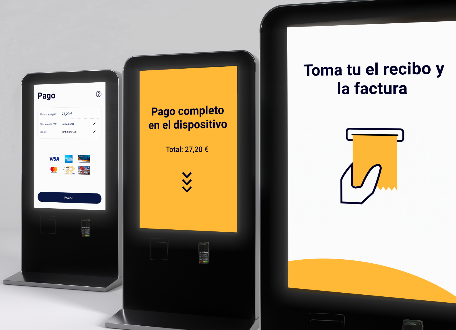
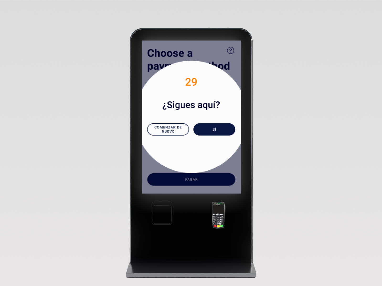
As a result, we designed an intuitive in-use self-service kiosk for quick and easy payments. We took care of adaptation to a very wide group of customers. Almost everyone uses petrol stations, so we had to take into account a lot of variables. We did it thanks to a lot of work that we put into the project. The kiosk has easy-to-use interfaces and features for wheelchair users. Everything was created in a consistent design according to the psychology of colors.