In this project we worked on a website and an online store operating on the cryptocurrency market. We took care of creating a dark mode for the visual side of Uniqly.io and UX corrections to improve its operation. Everything to ensure good user flow in the specific and complicated process.
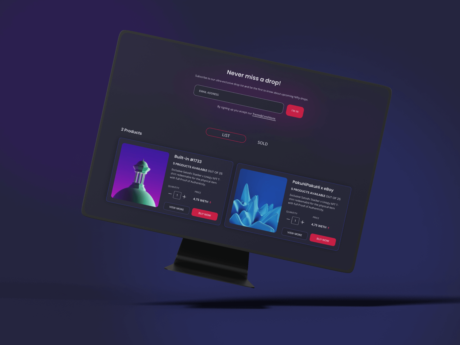
In this project, we were hired to redesign the Uniqly website. And to make the necessary corrections in terms of User Experience. We also conducted an audit of the gadget generator - functionality tests. This project was another challenge for us in the field of cryptocurrencies. It cannot be denied that this is a very specific market that requires a great deal of knowledge as well as a unique approach to design. See what we struggled with and how we managed it.
Uniqly presents itself as the first ecosystem that bridges digital NFTs with the physical world. And it really is an original idea on the market. Until now, cryptocurrencies and the goods that could be bought with them only existed in the digital world. Uniqly allows you to design your product and pay, for its physical production, with a cryptocurrency. In addition, they are not limited by a specific type of product, they can do many things - from clothes to luxury items. Thanks to Uniqly you can get products from your favorite brands, companies, influencers with Proof of Authenticity.
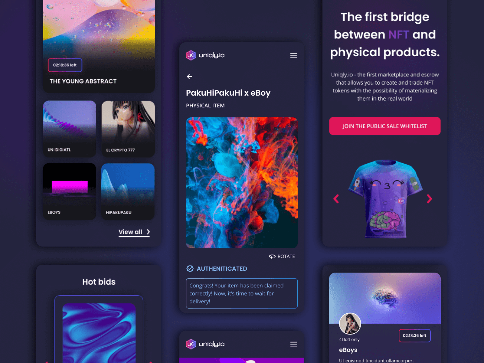
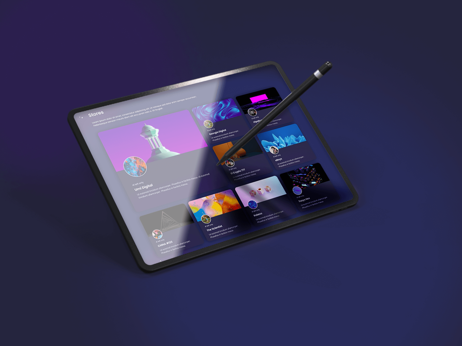
At the beginning of the project, we needed to get to know the topic and the operation of the website. The cryptocurrency market is a demanding area of UX activities. So, we made every effort to meet the needs of Uniqly users. We also had to learn the terminology and the way the cryptocurrency market functions. It was easier for us as we have experience in the subject.
A big challenge in the case of an online store on the cryptocurrency market is to create a good user flow. It's not a typical e-commerce business. The purchasing process is completely different here. First, the user has to obtain a cryptocurrency and then transfer it to a trusted wallet. Later, before the shopping, it must be transferred from the trading account to the new wallet, and then you can buy NFTs.
UX designers need to keep in mind how easily the user can get lost in the process. It was important to understand the tokenization and purchasing processes to create the right user flow. We wanted to make an intuitive interface where the user will know what to do, even if they are not an expert on the subject.
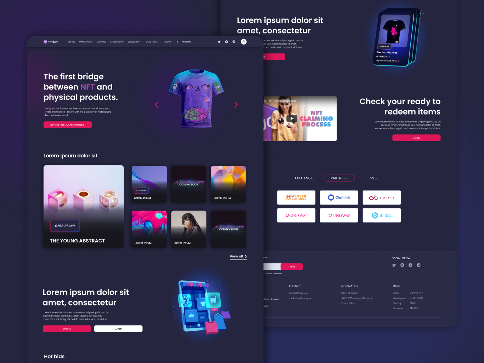
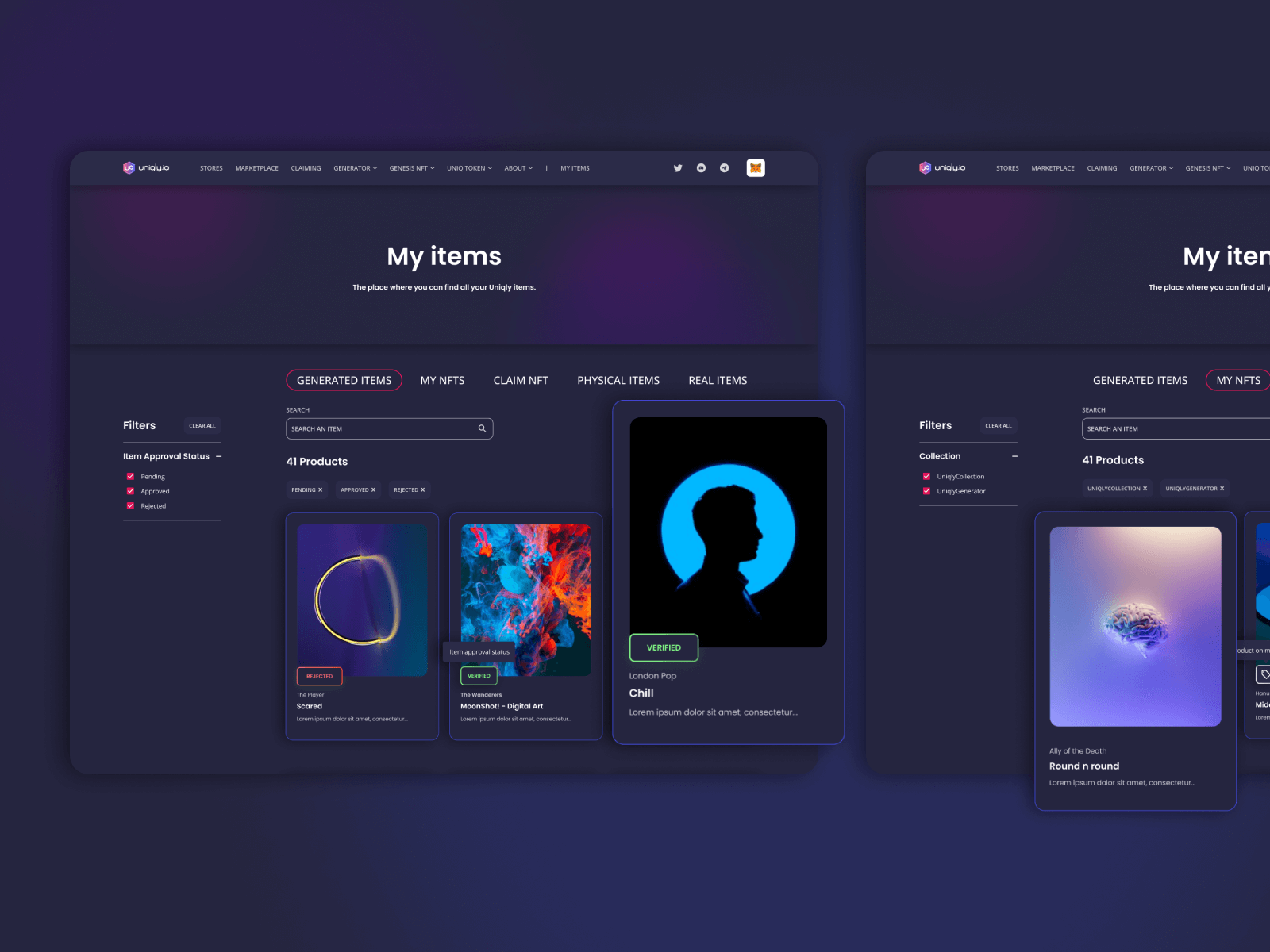
We took care of corrections on the website to improve user experience with the product and make its operation smoother. We organized the products in a specific store - we added filters and sorting and grouped the same products. We've dived the Stores section into two categories: Drops and Store. The collections appearing in Drops are exclusive and time-limited. Those in the Stores contain regular collections that are available for a longer time.
We also added counters in Drops that tell the user how much longer product is still available, what encourages them to buy it. It was also important to properly arrange the content to ensure that the user obtains all the information needed. Especially when we take into account how distrustful people can be when it comes to financial markets.
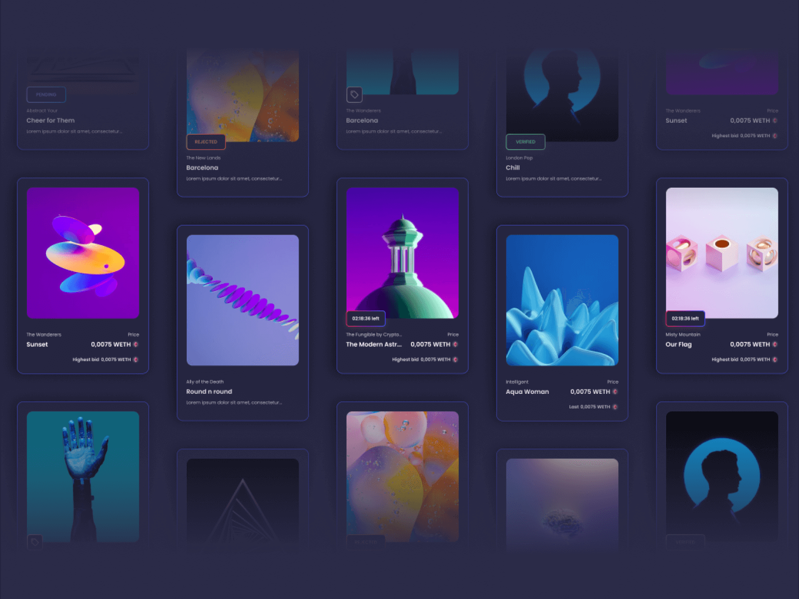
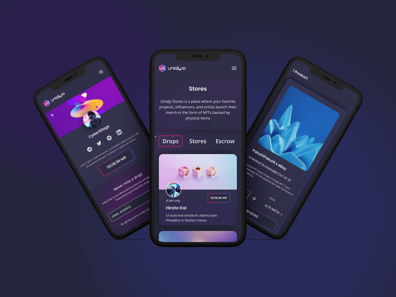
For the visual side of the project, we adapted to the colors that were already on the website and created a dark mode - previously the website was in a light version. However, when it comes to cryptocurrencies, dark design often works very well. Specific, colorful graphics look a lot better on a dark background. We wanted the design to attract attention. At the same time, we had to take into account the fact that while choosing colors, we should remember about readability of the content and maintain transparency in the interface.
The result of our work is a visually turned-up website designed in a dark mode. And also, the better performance of the website from the user's point of view. The UX corrections we made, as well as a good user flow, improved the purchasing process. The whole creates a friendly product that visually attracts and encourages to use with its functionality. And it's also a good and honest source of knowledge about the area of cryptocurrency and tokenization for physical goods.
- Workshops weekly meetings
- Figjam
- UX analysis
- Market and industry analysis
- Card sorting
- Brainstormings
- Figma interactions